This article reports on my experiences with A/B testing.
Where: Equipment store; we deliver all over the country
What: : A/B testing of two online order forms
When: Testing took place over three weeks
Usability professionals often talk about ways to improve conversion . These improvements are often related to the ordering process. However, these so-called improvements do not necessarily increase efficiency.
It is not always appropriate to compare sales from the first week of the month to sales from the second week of the month. Based on our experience with online stores, we know that people often make purchases immediately after receiving a paycheck. Therefore, it is important to collect sales data at a single point in time. A/B testing is the best way to analyze changes in sales. By conducting A/B testing, we have improved the KPI of our online store.
How We Did It
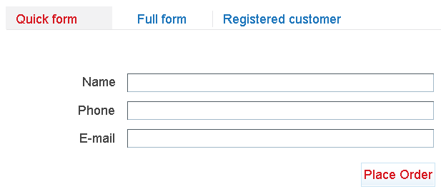
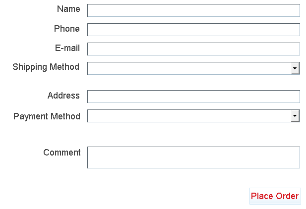
We had a lengthy order form, which did not include a “quick order” tab. We revised this order form to make it easier to use, removing the “full order” tab.
Quick Form
Full Form
Result
First Result: Once the store adopted the simplified form, our managers took longer to complete orders and made more errors than they had before. This was because orders were now placed orally . Managers and clients frequently misunderstood each other. Due to these misunderstandings, approval time for our orders increased. In light of these results, we asked our managers to return to the full order form.
Second Result: After returning to the full form, we decided to test the full and quick forms using A/B testing. The goal of A/B testing was to check the percent yield from the order page. We were especially interested in clients who began an order but did not complete the check-out process. The results of the experiment were inconclusive; the percentage of users’ output fluctuated within the normal range (± 5%).
Third Result: In our first test, we had tried using the quick form and the full form. For our second test, we included both the “full order” and “quick order” tabs. One half of users automatically landed on the full order page, while the other half automatically landed on the quick order page. Both tabs were accessible to all users, and users had the ability to switch between tabs. The results were surprising: output fell by 15 percent. All clients who participated in this A/B test placed an order.
Based on these findings, we now show all clients the quick form. However, we give them the ability to switch to the full form if they prefer.
To evaluate our new system, we asked clients to complete a quick survey after making a purchase. It turned out that most clients did not mind filling out the full form. Overall, they thought that the information requested on the full form (address, phone number, e-mail, etc.) was reasonable and logical.
The “one button” method of online ordering is problematic. As this experiment shows, most people prefer a clear form.
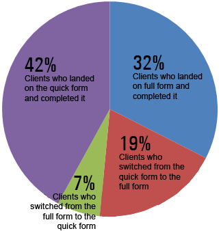
The diagram shows:
- Clients who landed on the quick form and completed it: 42%
- Clients who landed on full form and completed it: 32%
- Clients who switched from the full form to the quick form: 7%
- Clients who switched from the quick form to the full form: 19%
Source: Habrahabr
 Share on Facebook
 Share on Google
 Twitter