A successful online store. Which catalog is the easiest to navigate through?
In this report, five major online stores will be analyzed in terms of ease of navigation. As a test case, the following task was assigned: "Find the cheapest women's size M red sweater."
Amazon
Alexa Rank: 9 (01/01/2013)
Menu
From the catalog menu you can quickly find the required section in the Clothing, Shoes & Jewelry department. Note that the layout of information on the page is the same as on the homepage.
It took only 3 attempts to find the sweater in question. For user convenience the store offers a product reviews service.
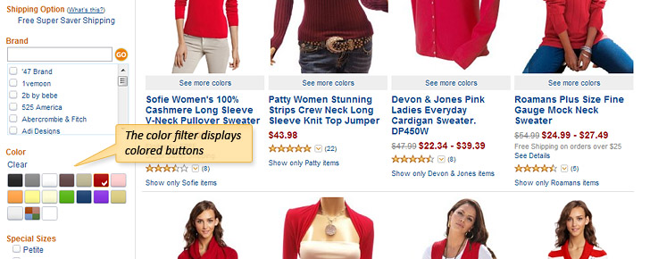
There is a variety of filters which help the user search through the catalog: Brand, Trend, Price, Discounts, Color, etc.

The directory has a "pseudo rubber layout," which means that the site is displayed in full screen width. This enables the information to be more evenly distributed on the screen than with a fixed layout, with the quantity of goods in each row remaining the same.
Pros
- The color filter displays colored buttons (which is easier than reading the name of the color).
- The filter can be disabled at the same place in which it was enabled.
Cons
- There is no Quick View function.
- Color is the most important filter parameter when selecting clothes. However, it is at the bottom of the filter list.
- The product image automatically changes when the mouse is hovered over it. When the user scrolls down the page, the images under the cursor continuously open and close. A simple zoom feature activated by a mouse click is easier on the eye.
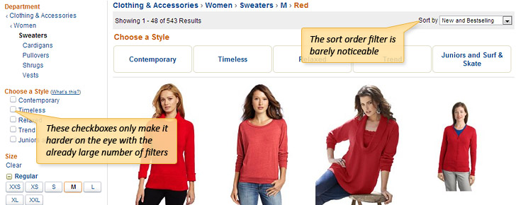
- Products are classified in increasing/decreasing order (in terms of price, number of reviews). Although the product classification is displayed in the usual place in the top right corner of the catalog, it is barely noticeable. In addition, there are few classification parameters.
- Next to the filter name is a checkbox that shows if the filter is enabled or not. These additional features only make it harder on the eye with the already large number of filters. Why not just display a Cancel cross when the filter is enabled?
- There are a lot of products on the page, and no Back to Top button. Why? It means that the user needs to constantly scroll all the way up.
There is quite a lot of information on the page, so a beginner has to get used to how it is displayed.
Overstock
Alexa Rank: 660 (01/01/2013)
Menu
It is much easier to find a sweater here, and it took just 2 clicks from the first attempt. Each item in the catalog is displayed from a single (standard) camera angle.
Searching the catalog
Again, it is easier to use this catalog than Amazon. A filter can be enabled according to category, color, size, brand and even the number of reviews.
Pros
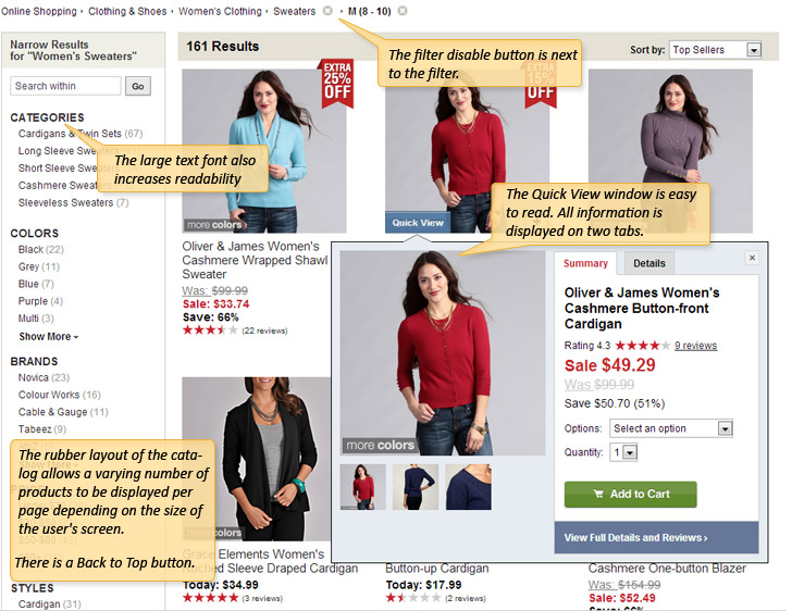
- Convenient Quick View function. This enables users to quickly view product information without having to open a new page
- The Quick View window is easy to read. All information is displayed on two tabs. It also contains additional product information and photos.
- Discounted products immediately attract attention due to the distinctive Sale icons.
- Product classification in increasing/decreasing order is easy to see (top of the page). In addition, there are quite a lot of classification parameters (6).
- The filter disable button is next to the filter.
- The filters are in the form of lists. The large text font also increases readability.
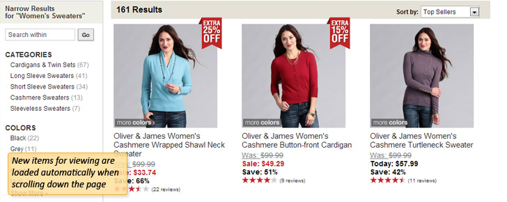
- The user does not need to open new pages, as the products are displayed dynamically. New items for viewing are loaded automatically when scrolling down the page, so there is no paging function.
- The rubber layout of the catalog allows a varying number of products to be displayed per page depending on the size of the user's screen.
- There is a Back to Top button.
Cons
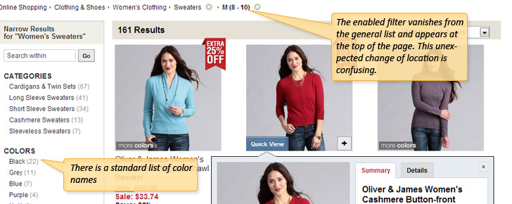
- The enabled filter vanishes from the general list and appears at the top of the page. This unexpected change of location is confusing.
- One other button moves around – the Back to Top button appears both on the left side and the middle of the page.
- Enabling the color filter is not as user-friendly as Amazon. In this case there is a standard list of color names.
Such simplicity after the Amazon “brainstorm” was well received. The required product can be found easily and quickly. The developers of the store have clearly paid considerable attention to usability and have created a sleek design with few details.
Victoria's Secret
Alexa Rank: 1115 (01/01/2013)
Menu
The combined menu also allows users to find a sweater in a couple of clicks. The main category names are displayed in the upper horizontal menu, with the internal categories displayed in the left-hand column.
Searching the catalog
The required sweater was found quickly. All the required sections are in the left-hand column.
Appearance of the catalog
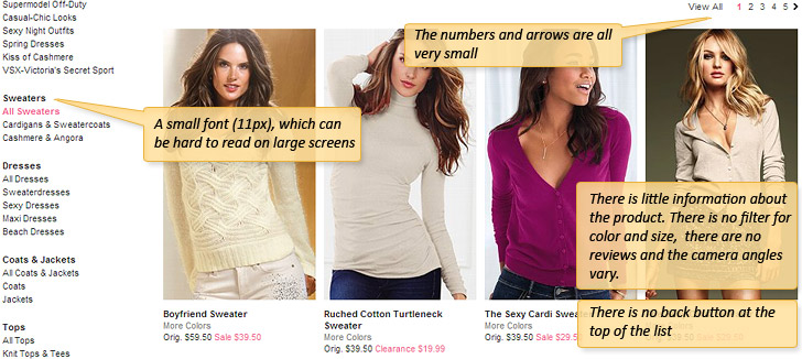
There is little information about the product. There is no filter for color and size, and there are no reviews and the camera angles vary. You can click to enlarge the image.
Pros
- The Quick view has only 2 parameters - size and color.
Cons
- The user still expects to see a drop-down menu when hovering over the main menu at the top.
- The list of categories and internal sub-categories are displayed in a small font (11px), which can be hard to read on large screens.
- There is the same problem with size with the paging function: the numbers and arrows are all very small.
- There is no back button at the top of the list, yet the catalog is quite large.
- There are no filters or even a price classification! If you want to find the cheapest size M sweater, then you have to rely on luck.
However, the models on the site are very beautiful and the store makes a great impression.
Revolve clothing
Alexa Rank: 8206 (01/01/2013)
Menu
The horizontal menu with drop-down boxes enables you to instantly find the sweater. This is the most common way to search for a required category.
Search the catalog
Here different category types are brought together. Besides the usual sections: Men, Women, Trend, there are the sections: Sale, Hot List, Blog, and New. The most popular products are advertised in the blog.
Appearance of the catalog
The category menu is vertical and located on the left. It is good that all the available information is not displayed immediately. There are two sections: Designers and Categories. Their contents are arranged alphabetically. A filter for color and price is also included.
Pros
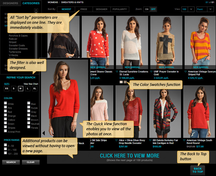
- The Quick View function enables you to view all the photos at once.
- The Quick View window, which keeps opening at the top left, can be disabled. Then the catalog will have a more traditional look, and the Quick View window will appear as would be expected, next to the product. But first you need to think about this feature and find the corresponding function.
- The classification system simplifies the search. All 4 classification parameters are displayed at the top of the catalog on one line. They are immediately visible.
- The Color Swatches function enables you to view additional color options for a particular product. This means that additional color options for a particular item are immediately visible, because small colored icons are displayed under each item.
- The filter is also well designed. It contains 3 main parameters (color, size, price) and has a reset button.
- The developers did not forget about the Back to Top button.
- The View More Products button has successfully replaced the paging function at the bottom of the page. Additional products can be viewed without having to open a new page.
Cons
- The category list is not only displayed in the main menu, but also in the left-hand column. But it is strange that you have to scroll down. Instead of displaying the categories in the left-hand column, the filters could have been displayed higher up the page.
- The Quick View window does not open in the expected way and appears in the left-hand column. It is not very convenient to have to scan across to the left-hand column when viewing items in the lower right-hand corner of the page.
- In terms of additional information, the Quick View window offers only images which are slightly larger and the sizes of that item in stock.
- The filter for color is presented as a list of color names, as opposed to icons.
- The Back feature (view all products from the back) is interesting but unnecessary.
Ssense
Alexa Rank: 9726 (01/01/2013)
Menu
The vertical menu allows users to quickly find the required category (2 clicks). This site specializes in designer clothing. The only concern here is the prices
Searching the catalog
It is very difficult to find a product when you know exactly what you need. Firstly, all the items are displayed in an endless catalog through which you have to browse through to find what you want. Secondly, there are no filters whatsoever, and only a list of categories. It is not possible to filter products by color, price, etc. So it is impossible to find a red sweater without viewing the entire contents of the Sweaters category.
There are also no buyer reviews. Maybe no one has actually dared to buy any of these products?

Pros
- The rubber layout of the catalog is the same as in Overstock.
- The paging function is user friendly: the page number has a fairly large clickable area.
Cons
- When you hover the cursor over a product, the image changes. The constant flickering of images when moving around the page quickly tires the eyes. To prevent this, a simple Enlarge Photo button is needed.
- There is no Quick View function.
- Poor choice of font (uppercase) for the category menu and product titles. Constant capital letters are difficult to read.
- It is strange that the directory does not load automatically. The catalog page is very long, requires scrolling, and at the bottom the user comes across the paging function.
- Another minus is that there is no Back to Top button.
- There are only 3 parameters (price, date, discount) in the left-hand column, instead of the expected filters.
This site is for wealthy people who have the time and money to slowly browse the site in search of a product
It is important for the user that:
- The search function is user-friendly.
- Information. It is better to organize information so that each part is only displayed when needed.
- Sale icons on products in the catalog immediately attract attention.
- There are product reviews.
Parameters that facilitate navigation through the catalog:
- Easy-to-use filters (color, price, size, etc.).
- Classification with a clearly visible list (on one line).
- Quick View function.
- No paging function.
- Back to Top button in large catalogs.
- Color Swatches.
The increasing trend towards adaptive design/rubber layout could lead to information redundancy on the page. For stores with a small catalog this is not required.

Click to enlarge
 Share on Facebook
 Share on Google
 Twitter